Click here to visit Original posting
One of the most appealing things about R is its ability to create data visualizations with just a couple of lines of code.
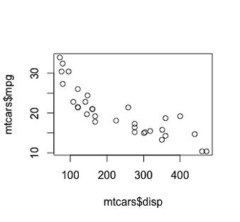
For example, it takes just one line of code -- and a short one at that -- to plot two variables in a scatterplot. Let's use as an example the mtcars data set installed with R by default. To plot the engine displacement column disp on the x axis and mpg on y:
plot(mtcars$disp, mtcars$mpg)
You really can't get much easier than that.
To read this article in full or to leave a comment, please click here